Meal Magic
AI-Powered Meal Planning App
Meal Magic is an AI-powered meal planning app aimed at helping busy individuals organize their meals, reduce food waste, and simplify grocery shopping. It enables users to scan their fridge items with AI, receive personalized recipes based on available ingredients, and get alerts for upcoming expiration dates.
Tools:
Miro, Figma, Recollective
Role:
UI design, UX research
Timeline:
2-semester capstone project

Role
Tools
UX Researcher
UI Designer
Solution
Busy individuals and families often struggle with planning healthy, budget-friendly meals. With the limited time and a desire to avoid food waste, one can find it challenging to keep track of ingredients, manage dietary preferences and prepare nutritious meals that satisfy everyone. The current meal planning options are either too generic or require too much effort, failing to address their unique needs. This issue arises because existing solutions lack the adaptability and personalization necessary to fit users' busy lifestyles and unique dietary needs.
Challenge
In my first semester, I worked on a project about understanding expiration dates on consumer products. What seemed simple at first led me to eye-opening statistics about food waste—
almost a third of all food globally is wasted, with much of it due to confusion around expiration labels.
This insight sparked an idea: what if a meal planning app could help people track their pantry items, use ingredients efficiently, and reduce waste? Inspired by this, I envisioned a meal planning app that not only simplifies meal planning but also encourages smarter grocery management, helping users save money and minimize food waste.
Design Process
Empathize
Define
Ideate
Prototype
Test
Empathize: Understanding User Needs
To create a truly useful meal planning app, I began by deeply understanding the needs, challenges, and goals of potential users. I conducted empathy interviews with individuals aged 25-45, who expressed a desire for efficient, healthy, and budget-friendly meal planning. These users were busy professionals, students and parents who often struggled with tracking ingredients, managing dietary needs, and balancing nutrition with taste.
Primary User Group:
Other Stakeholders:
Busy Individuals - Working Professionals, Students, Families
Grocery Retailers - who can provide ingredient delivery.
Nutritionists & Food Brands - who might benefit from partnerships with the app, offering recipes or dietary advice.
Interviewee 1
"I need meal recommendations that align with my dietary preferences and health goals. It would be great if the app could learn my tastes over time and make better suggestions."
Personalization
Interviewee 2
"I often buy ingredients but forget about them, which leads to a lot of waste. It would be really helpful if the app could track what I already have and remind me before things expire."
Efficiency & Flexibility
Interviewee 3
"A section with articles or videos on meal prepping or nutrition would be great. It’d help me plan meals more thoughtfully."
Educational Content
Interviewee 4
I’d enjoy being able to follow people with similar dietary goals and see their favorite recipes—like a social aspect within meal planning."
Community & Social Features
Interviewee 5
"It would be helpful if the app had guides on nutrition basics or cooking tips—sometimes I need a little guidance on healthier choices."
Integration with Other services
Competitive Analysis
A comprehensive competitive analysis was conducted, evaluating similar apps in terms of features and user experience

Strengths:
- Most apps excel in grocery list integration and recipe organization, making it easy to plan and shop.
- Personalized meal plans are common, though often limited to dietary preferences rather than real-time adaptability.
Weaknesses:
- Only Chefling app offers expiration alerts.
- No app combines AI-image recognition with real-time inventory updates, leaving room for innovation in automating Inventory management.
- Most apps lack real-time adaptability, which would allow plans to adjust based on immediate feedback or pantry changes.
This analysis shows a clear opportunity for a solution to stand out by integrating AI-image recognition, expiration tracking, and real-time adaptability to offer a truly dynamic and user-centered meal planning experience.
Define: Clarifying the Design Problem
With a deeper understanding of user needs, The problem centered around helping users plan meals efficiently and use up ingredients without waste. Given the time and dietary constraints, the app needed to prioritize ease of use, automation, and personalization.

"How might we create a meal planning app that integrates seamlessly into users’ lives, helping them eat well, save time, and reduce food waste?”
Problem Research
Ideate: Exploring Solutions
During the ideation phase, I brainstormed ideas that could address the problem effectively, prioritizing a balance between automation and user control, I referred to the below research articles:
Ideate: Exploring Solutions
During the ideation phase, I brainstormed ideas that could address the problem effectively, prioritizing a balance between automation and user control. I explored three main concepts:


I decided to move forward with the AI-Powered personalization with Community-driven features, as it provided the best balance of personalization, simplicity, and user control. This choice aligned directly with the goals of reducing food waste, saving time, and making meal planning a manageable part of busy users’ routines.This Hybrid approach allows for a flexible system that can cater to user prefer more automation as well as those who enjoy a more hands-on approach to meal planning and recipe discovery.
AI-Powered Meal Planner with Community-driven features
A system that would personalize meal plans based on user preferences, dietary needs, and real-time inventory. This concept focused on AI that would handle meal recommendations and grocery list creation with minimal user input, along with features where users could share recipes and meal plans, creating a collaborative experience.
1. Personalization Engine:
The AI system must be robust enough to accommodate varied dietary needs, preferences, and schedules.
2.Community and Social Features:
The app should include recipe sharing, virtual cooking events, and forums for users to engage with one another.
3.Educational Content:
Incorporate video tutorials, quick tips, and skill-building challenges to support different skill levels and interests.
4.Efficiency and Flexibility:
Ensure quick, adaptable meal plans that cater to time constraints and changing family or personal needs.
5.Integration with Other Services:
Integrate features like grocery shopping and fitness tracking for a holistic experience.
Design Tradeoffs
Personalization vs. Standardization:
Balancing personalized meal plans tailored to users' dietary needs with standardized options for a simpler experience.
Automation vs. User Control:
Deciding how much to automate (like grocery lists) versus letting users control each step in meal planning.
Complexity vs. Simplicity:
Offering advanced features while maintaining an easy-to-navigate interface to prevent overwhelming users.
Health Focus vs. Taste Preference:
Balancing health-focused recommendations with meals that cater to users' taste preferences and variety.
Prototype: Building the Solution
With a clear concept, I moved to the development phase, creating both low-fidelity and high-fidelity prototypes to test functionality and design.


I started with basic wireframes to establish the core user flows, such as scanning ingredients, viewing meal suggestions, and managing the grocery list. This initial prototype allowed me to experiment with different layouts and identify potential bottlenecks in navigation. I tested these wireframes with a small group of users, who provided feedback on clarity and navigation.


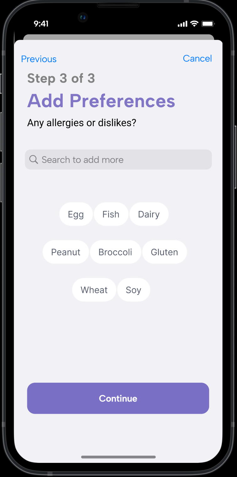
After refining the layout, I developed a high-fidelity prototype in Figma, focusing on creating a clean and intuitive interface. The UI design included:


Test: Gathering User Feedback
To ensure Meal Magic App met user expectations, I conducted two rounds of usability testing with same 5 set of participants, focusing on core tasks like creating meal plans, swapping meal plan, organizing the grocery list, and nutritional tracking.
Usability Testing:
Participants completed key tasks, allowing me to observe their interactions and note any friction points.
Post-Test Surveys:
Surveys captured both quantitative and qualitative feedback, measuring user satisfaction and areas needing improvement.
Participants
Five participants engaged in usability testing from their homes using smartphones:
P1: 28-year-old software engineer, vegetarian, cooks frequently.
P2: 35-year-old marketing manager with two children, no dietary restrictions.
P3: 40-year-old healthcare professional and single parent, gluten-free.
P4: 32-year-old financial analyst, dairy-free.
P5: 37-year-old project manager for a family of four, one child with a nut allergy.


Strengths:
-
Customization and AI Recommendations: Users responded positively to the meal customization feature, highlighting its flexibility and the relevance of AI-powered meal suggestions.
-
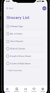
Grocery List Feature: Achieved high engagement, with 80% of users finding it easy to manage.
Pain Points:
-
Meal-Swapping Interface: Users found the visual hierarchy unclear, making meal swapping less intuitive.
-
Nutrition Information Presentation: Considered overwhelming; users suggested a more simplified layout for quick checks.
Quantitative Results
-
Meal Plan Creation: 100% completion (5/5 users)
-
Grocery List Generation: 80% success rate (4/5 users)
-
Meal Plan Customization: 100% completion with minor UX friction reported
Qualitative Results
“It’s great to get reminders about ingredients that need to be used up—makes me feel less guilty about food waste.” -P3
“It’s fun to share recipes, but I wish it was easier to categorize them by dietary preferences or cooking time. That would make browsing quicker!” -P1
The expiration alerts would be like a little helper in my kitchen to use ingredients I’d otherwise forget.” -P5
1. Severe (Immediate Action Required):
The meal-swapping feature's visual hierarchy led to user confusion, warranting a redesign with clearer visual cues, step-by-step guidance, and more immediate feedback.
2. Major (High Priority):
Inconsistent labeling within the grocery list made it difficult for users to track customized items, suggesting a need for standardized labeling, categorization, and visual indicators.
3. Minor (Medium Priority):
The complexity of the nutrition tracker caused information overload; a simplified quick-view option with progressive disclosure and a customizable dashboard could improve accessibility.
4. Cosmetic (Low Priority):
The "Community" tab appeared cluttered, which hindered recipe discovery. Enhancing recipe categorization, improving search functionality, and streamlining UI elements could address this.
Issues Recorded
Next Steps
Improve Meal-Swapping Feature
Make the meal-swapping option easier to use by adding clear visuals and step-by-step guidance.
Add Inventory Tracking
Develop a feature that lets users track pantry items to prevent buying duplicates and reduce food waste.
Simplify Nutrition Tracker
Create a quick-view option for nutrition information, making it easier for users to get a quick overview of key nutrients.
Enhance Community Section
Redesign the community section to be more organized, with better search and filtering options so users can find recipes more easily.
Learnings
1. Keep it Simple - I learned that too many details can overwhelm users. Simplicity is key, especially in daily-use apps.
2. Listen to Users - User feedback helped me improve features like meal-swapping and grocery lists. Real user needs shaped the app’s design.
3. Expect the Unexpected - I didn’t anticipate the strong demand for an inventory tracker. This taught me to stay open to new ideas from users.
4. Visual Cues Matter - Clear visuals make complex features easier to use, like the meal-swapping option. Good design helps users navigate without extra help.
5. Test, Test, Test - Regular testing revealed what worked and what didn’t, making it easier to create a better app with each update.